

A new logo for the 30th anniversary
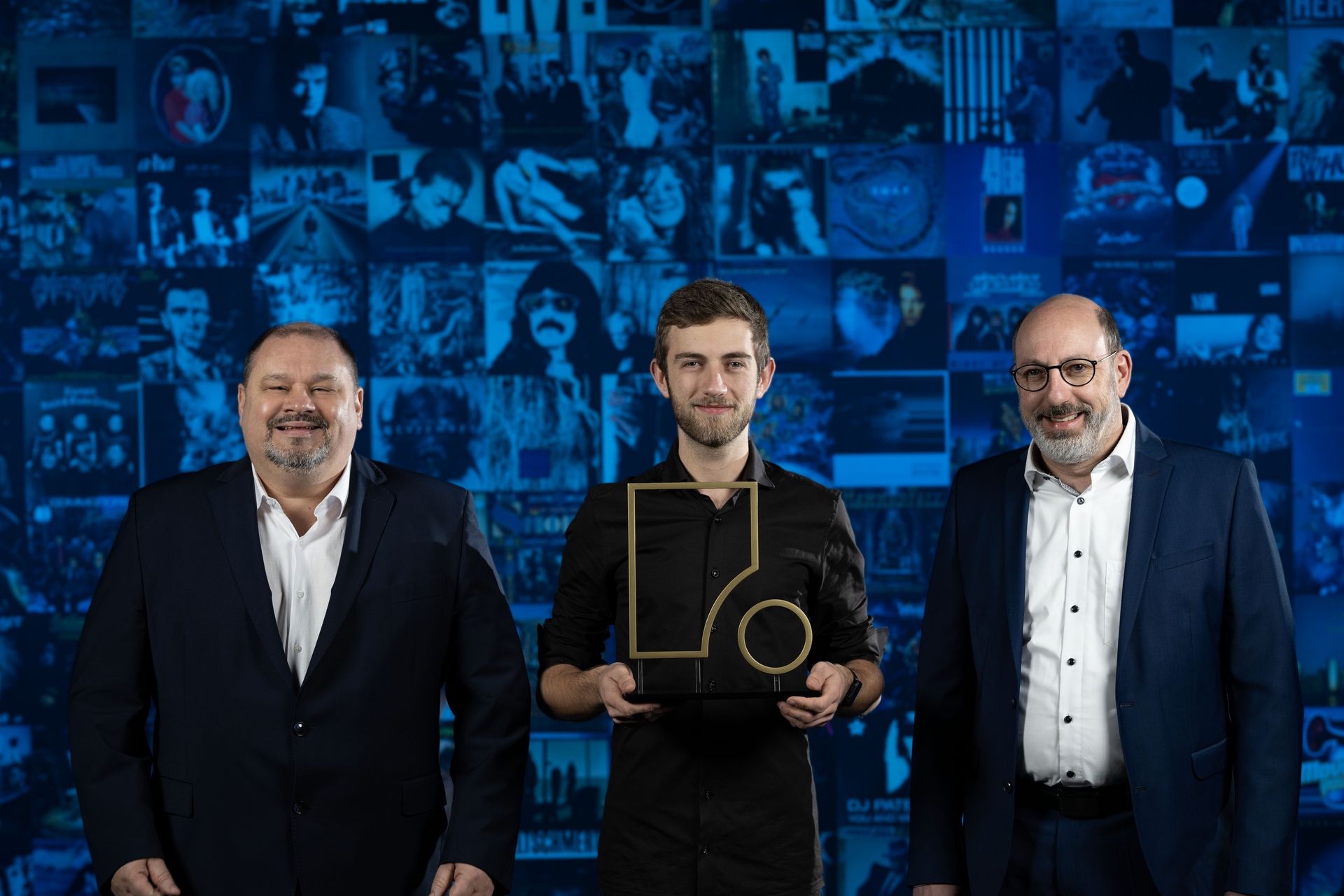
Over time, the Fohhn logo has changed slightly for a few times. The new iteration is certainly the biggest: a clear simplification. The wide "F" is being kept - its now angular shape stands for technology, rationality and precision. Some pianists may also recognise the contour of a grand piano. The circle symbolises emotion, art and sound. It reminds of a loudspeaker membrane.
The previous corporate color orange is replaced by a more muted sky blue. The softer, light color represents openness and also the discreet way in which Fohhn systems can be visually integrated. With the claim "Colors of Sound", there will also be multicolored elements that underline the diversity and flexibility of the portfolio, Fohhn Customizing and the brand.
With its new image, Fohhn is looking ahead to an eventful future – with both anticipation and confidence. The foundation for this has been laid. Milestones have been the in-house development of amplifier series, the expansion of the widest beam steering range on the market and the construction of the new company building, including the Fohhn SoundLab. Future innovations are already underway with new conferencing solutions, PoE speakers and new beam steering systems. The commitment to sustainability is also a key part of the future orientation. Fohhn takes the awards for this field as an encouragement to do even better in the future. More information about new products and sustainability will be shown at the ISE in Barcelona in February.
Be the first to know!
Newsletter subscription
Nobody likes spam - neither do we. From time to time you will instead receive news, announcements and knowledge tranfser relevant to you from our pro audio experts.